Landing in Wellington

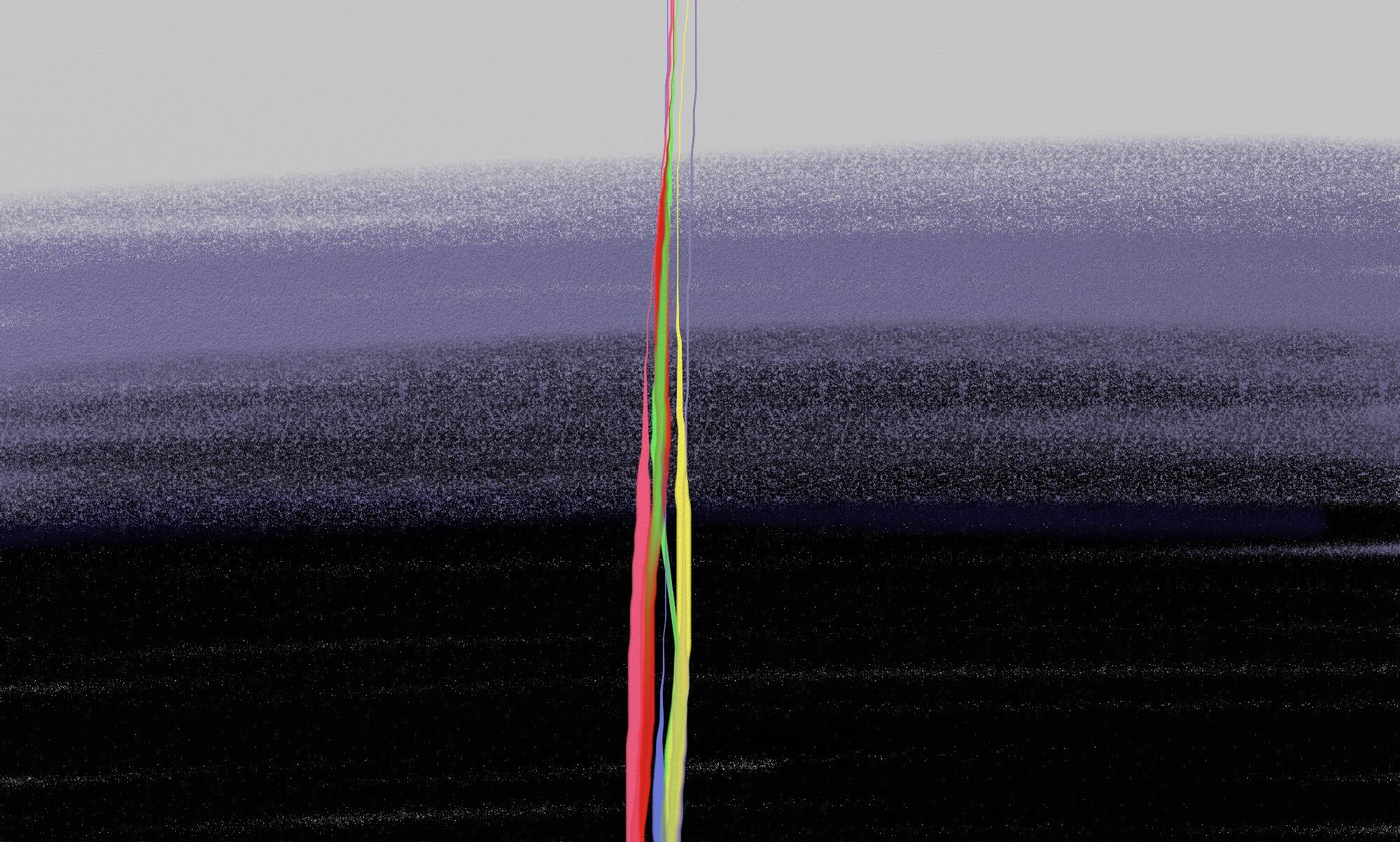
#309 Landing in Wellington
Click for larger image.

This one goes back to early October 2006. I did this on the plane while landing at Wellington airport. Plane air (sorry) I overlooked it at the time, perhaps did not deem it worthy. However I salvaged it.

~

This print is in a limited edition of 25 Giclée prints on A4, 21 cm x 29.7 cm archival paper. The image size is 17.5 cm x 12.5 cm. The next available print is: 1/25

~

Technorati tags:

Playing Pollock 1

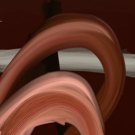
#306 Playing Pollock 1
Click for larger image.

This and the next few were done using a really funny flash animated tool on the web: Here Have a go! I confess, in the past, having some disdain for splashing paint as Pollock did. That changed in two steps. One was seeing an original in the Dunedin art gallery about 5 years go. It was quite a small painting and the texture was created with small splashes. The painting was subtle and finely executed, notions I would not have associated with Pollock through my media fed ignorance. The second thing was the Ed Harris movie. Maybe he was more unlikeable in real life, and his wife may be more instrumental in the development of the form than portrayed, but the one thing I love & it is shown well in the movie, was the way he danced his paintings into life, he moved with grace, Ed Harris took years to learn that for the film.

So, here are a few playfully splashed, using the Flash toy. Thanks to whoever made the software.


Technorati tags:

Blocks

#305 Blocks
Click for larger image.

Consciously exploring a form. Composed squares of colour. I found it harder than it looks, deleted a lot, and not satisfied yet, though this was the survivor. I will look for more that I like in the genre – and make an “inspiration” post.

There – another little project within a bigger one.

~

This print is in a limited edition of 25 Giclée prints on A4, 21 cm x 29.7 cm archival paper. The image size is 17.5 cm x 12.5 cm. The next available print is: 1/25

~

Technorati tags:

Place 4

#304 Place 4
Click for larger image.

Of these “place” abstracts this one satisfies me most. It is the one I spoke about in an earlier post: here.

~

This print is in a limited edition of 25 Giclée prints on A3+, 33 cm x 48 cm archival paper. The image size is Full. The next available print is: 1/25 This one and the next few I am printing “borderless” on A3+ 13 x 19 inches. They will need to be framed with a mat around, not on them.

~

Technorati tags:

Place 1

0301_place1-sqr

#0301 Place 1

It was with this question, literal or expressive in mind that I began the next few. They are not expressive of Mt Cook, but of my immediate place in Christchurch at the time. Expressive but I allowed nothing literal in, not even the colour really, so this is all from within.

Caroline Face Aoraki

#300 Caroline Face Aoraki
Click for larger image.

Back to my last day at Mt. Cook. I loved the walk to the Ball Shelter, this is pure nostalgia. I spent a lot of time here in 1996-7, first on a climbing course, then climbing many of the peaks in the area in the summer, and ski mountaineering in the spring.

There is no view of Aoraki while walking up to the shelter, it is blocked out by the range on the left. Once past the shelter I waked up to a point on the ridge and looked up at the Caroline face of Aoraki. Even though the height is forshortened from so close up, the mountain has a power, beauty and sheer impact that I do not see in my sketch. I don’t know how to do it!

Do I try something more literal? Or expressive?

Later…

How about a stretch?

0300_caroline copy